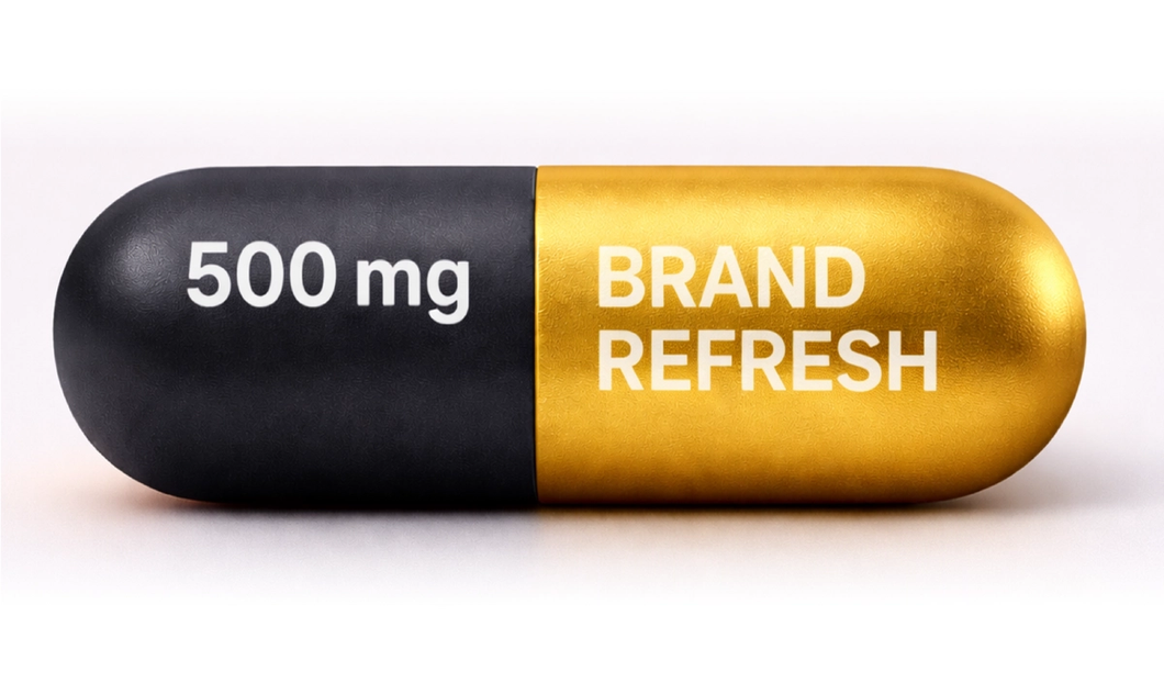
Does your Brand Packaging need a Design Makeover?
Why Attractive, Compliant Packaging Matters in Ireland’s OTC and Prescription Medicine Markets
In healthcare, packaging is never just packaging. It is a brand asset, a safety tool, a source of product information and, often, the first tangible moment of trust between a medicine and the person who uses it. In Ireland, where medicines move through hospitals, GP practices, community pharmacies, online pharmacy channels and home settings, packaging has to work extremely hard. It must be clear, compliant, legible, recognisable, practical and reassuring, while still feeling modern enough to meet today’s visual expectations.
For both OTC and prescription medicines, the opportunity is not to make packaging louder. It is to make it better. A thoughtful packaging refresh can improve visibility, support safer use, strengthen brand recognition, reduce confusion and make a mature product feel more relevant. However, every creative decision must sit within Ireland’s regulatory framework. The HPRA regulates medicines advertising in Ireland and expects it to be accurate, not misleading and aligned with approved product information. IPHA’s codes also set standards for medicines promotion and advertising, including self-care medicines and prescription medicines.
The commercial case for modernisation
The Irish pharmacy environment is busy. Consumers compare products quickly, often across similar formats, strengths, claims and price points. Pharmacy teams are also navigating workloads, substitutions, stock challenges, counselling conversations and patient queries. A pack that communicates clearly is not simply more attractive. It is easier to identify, recommend, dispense and use.
This matters because pharmacy marketing is increasingly omnichannel. In-store, online, click and collect, digital screens, category features and customer database communications are now all routes to visibility and conversion. Packaging therefore has to perform on shelf, in thumbnails, banners, emails, point-of-sale displays and e-commerce journeys.
A modern pack gives a brand a stronger base for all of these touchpoints. If the typography is dated, the colour system is unclear or the hierarchy is weak, the brand can look tired before a campaign has even begun. Conversely, a fresh pack with confident structure, contemporary fonts, accessible colour contrast and consistent visual rules can make every media placement work harder.
OTC packaging: attraction with responsibility
OTC medicines sit in a demanding space. They need to attract attention, differentiate from competitors and help consumers navigate symptoms, formats and usage occasions. At the same time, they must not overclaim, exaggerate benefits, encourage unnecessary use or blur the line between healthcare advice and promotional persuasion.
For OTC brands, packaging should quickly answer four questions: what is it, who is it for, what does it help with and how should it be used safely? Modern design can make those answers easier to find. Larger, cleaner typography can improve readability. A disciplined colour palette can help distinguish variants. Icons can support navigation when used carefully. White space can make important information feel less crowded. A simplified front-of-pack hierarchy can reduce the temptation to overload the design with secondary claims.
The strongest OTC redesigns often come from restraint. A cold and flu range may need clear differentiation between day, night, sinus, cough or maximum-strength variants. A digestive health product may need to communicate format, flavour and suitability. A pain relief product may need to distinguish strength and active ingredient without implying superiority that cannot be substantiated. In each case, the creative solution should be built around the authorised product information and the consumer’s real decision journey.
Prescription packaging: trust, recognition and safer use
Prescription medicine packaging works differently. It is not designed to persuade the public to choose a product in the same way an OTC pack might. Its role is linked to identification, trust, professional confidence, patient adherence and safe administration. For prescription medicines, modernisation can still be valuable, but the emphasis is on clarity, consistency and reduced risk.
A prescription pack may be handled by wholesalers, pharmacists, hospital staff, nurses, carers and patients. It may sit beside medicines with similar names, strengths, formulations or pack sizes. A refresh can support safety by improving name prominence, strength differentiation, dosage form clarity, barcode placement, expiry and batch legibility, and the relationship between outer carton, blister, label and leaflet.
Modern fonts and colours can help, but only when used intelligently. A fashionable font is useless if it reduces legibility. A striking colour palette can become a risk if it causes look-alike confusion across strengths. A minimalist design can be elegant, but not if it hides critical information. In prescription medicines, good design removes friction. The pack feels calm, structured and trustworthy.
Compliance is not a barrier to creativity
One common misconception in healthcare marketing is that compliance prevents creativity. In reality, compliance gives creativity its job. It defines the boundaries within which design must solve a problem. The HPRA’s guidance on labels and leaflets refers to mock-ups that show full-colour artwork and demonstrate the three-dimensional presentation of label and leaflet text. The HPRA also states that information on labelling and package leaflets should be clearly presented so patients can understand and use medicines safely and appropriately, and that labelling and leaflet information should be consistent with the SmPC.
These requirements do not stop a brand from modernising. They mean every design choice has to support safe, accurate communication. A refresh should protect the required particulars, preserve approved terminology, maintain readability, respect product authorisation requirements and avoid introducing promotional claims or visual impressions that go beyond the licence.
The same principle applies to promotional materials linked to packaging. The HPRA regulates medicines advertising under the Medicinal Products (Control of Advertising) Regulations 2007, and its guidance covers advertisements to the public and to those qualified to prescribe or supply. IPHA states that its codes aim to ensure high standards in promotion and advertising, and that member companies must observe them in spirit as well as letter. Packaging, point of sale, detail aids, digital assets and campaign messages should therefore be reviewed as a connected ecosystem.

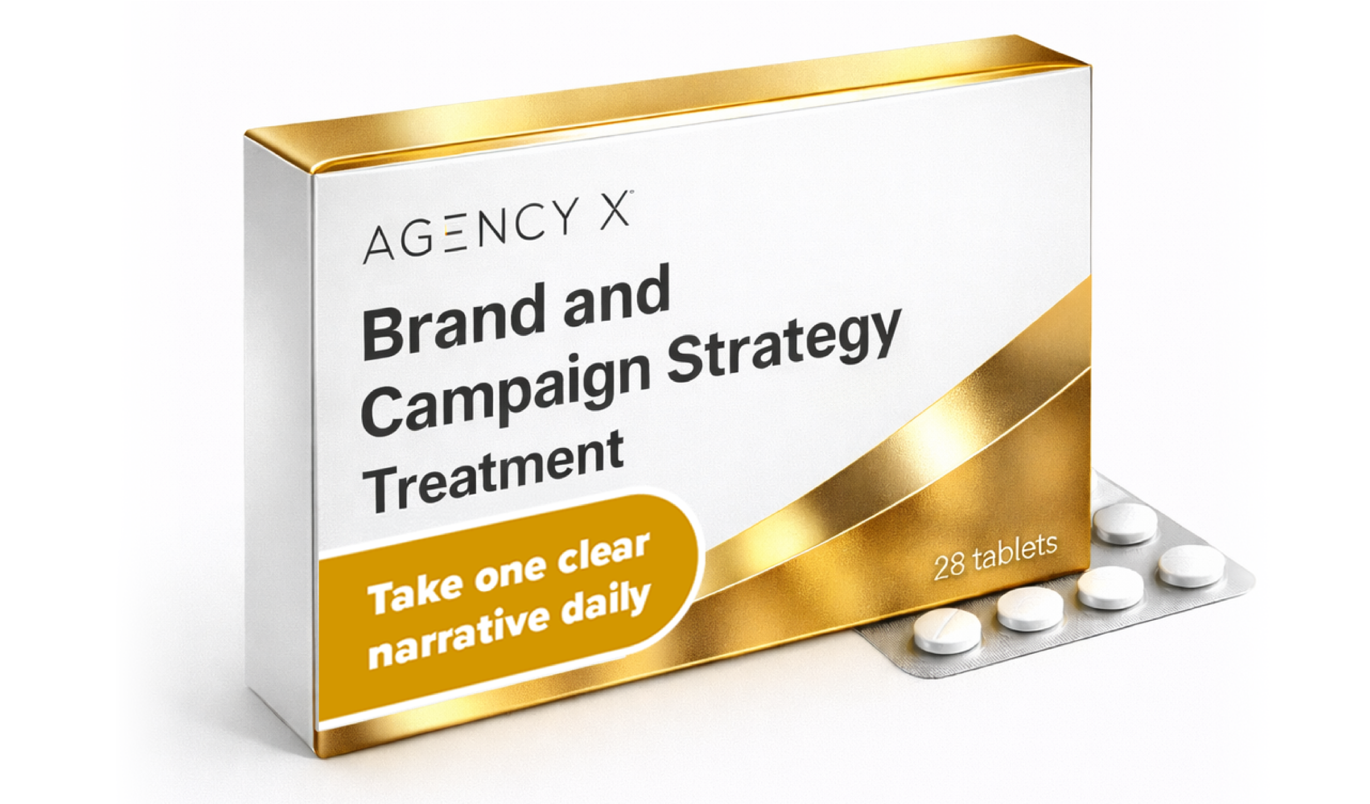
What modern packaging should improve
A packaging refresh should begin with an audit, not a moodboard. The first question should be: what is the current pack failing to do? It may look dated beside competitors. It may be hard to read at shelf distance. Variants may be too similar. The active ingredient may be unclear. The brand may not scale well online. The pack may have inherited years of edits that have left the design cluttered.
Once the problem is defined, the refresh can focus on practical improvements. Typography should be legible, contemporary and suitable for print at small sizes. Colour should build recognition while supporting safe differentiation. Layout should create a clear hierarchy from brand, product name and strength through to format, quantity and essential information. Imagery should be relevant, compliant and not misleading. Claims should be checked against authorised product information and applicable codes. Accessibility should be considered, including contrast, spacing and readability for older or visually impaired users.
Production reality matters too. Packs must survive print processes, folding, handling, serialisation requirements, barcodes, tamper evidence, multilingual requirements where relevant, and pharmacy labelling. Beautiful artwork that fails in production is not good healthcare design. Neither is packaging that looks strong in a presentation but loses clarity on a small carton or mobile screen.
Designing for pharmacy teams and patients
Pharmacy teams are central to the success of healthcare brands in Ireland. They see which packs cause confusion, which products are easier to find and which messages trigger questions. Their insight should feed into any refresh. For OTC medicines, pharmacy teams can advise on shopper behaviour, misconceptions and the information patients look for first. For prescription medicines, they can identify dispensing pain points, look-alike and sound-alike risks, and practical issues with labels or storage.
Patients and consumers should also be considered early. Readability testing, user review and real-world mock-ups can reveal problems that are easy to miss on screen. Can someone identify the strength quickly? Can they tell two variants apart? Is the dosage form clear? Does the design look trustworthy? Does it feel modern without feeling cosmetic? In healthcare, the best packaging design respects the seriousness of the category while recognising that people respond to clarity, confidence and visual appeal.
Refresh, do not confuse
A packaging refresh should protect existing brand equity where it matters. Many medicines have long-standing recognition among pharmacists, prescribers and patients. Changing too much too quickly can create uncertainty, especially for products used regularly. The challenge is to modernise without breaking recognition.
That can be achieved by retaining distinctive brand assets such as core colours, name style, symbols or layout patterns, while updating the wider system around them. A phased approach may be useful for larger portfolios, especially where multiple strengths, indications or formats are involved. Clear internal guidance, pharmacy communication and updated digital assets can help ensure the refreshed pack lands smoothly.
The future is modern, disciplined and patient-centred
In Ireland’s OTC and prescription medicine sectors, attractive packaging is not superficial. It is a strategic asset that can improve brand performance, support safer use and help products compete in a demanding healthcare environment. But attractiveness must be understood properly. It is not about chasing trends. It is about making medicines easier to recognise, understand, trust and use.
Modern fonts, cleaner colour systems, better hierarchy, improved accessibility and more consistent brand architecture can all make a meaningful difference. The brands that will benefit most are those that treat packaging refreshes as multidisciplinary projects, bringing together marketing, regulatory, medical, quality, supply chain, pharmacy insight and patient perspective from the start.
Compliance with HPRA requirements, IPHA standards and approved product information should never be seen as the final hurdle. It should be built into the creative process from day one. When that happens, packaging can be both modern and responsible, distinctive and compliant, commercially effective and patient-centred. In a market where trust is everything, that balance is essential.
Agency X has extensive experience working with pharmaceutical and healthcare companies to conceptualise, design and produce refreshed brand packaging that feels modern, distinctive and market-ready, while always respecting the regulatory requirements of the sector. To begin the conversation about your next packaging refresh, contact us at hello@agencyx.ie.
Contact one of our Events managers at Agency X today to discuss how we can help plan your upcoming Corporate Conference or Event.We'll be delighted to help!