Safe Doesn’t Have to Mean Same:
Why Irish Healthcare Needs Braver Creative Design
Healthcare marketing has always had to operate within boundaries.
Accuracy, claims and appropriate language matter, and of course crucially regulatory approval matters. So whether you are communicating with healthcare professionals, patients, carers or the wider public, there is an obvious responsibility to get the message right.
But somewhere along the way, being responsible can become confused with being conservative.
The result?
Healthcare communications that are perfectly correct, perfectly compliant – and perfectly forgettable.
In an increasingly crowded Irish healthcare, pharmaceutical and medtech market, that presents a problem. Because before your audience can understand your message, engage with it or act on it, they first have to notice it.
That is where great creative design comes in.
The challenge for healthcare brands today isn't choosing between creativity and compliance. It is finding the sweet spot where strong strategy, clear communication, distinctive design and regulatory responsibility work together.
And that's where things get interesting.
The danger of the healthcare 'sea of sameness'
Spend enough time looking at healthcare communications and certain visual conventions quickly emerge.
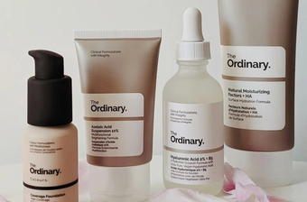
Blue and green colour palettes. Smiling patients. Healthcare professionals in white coats. Molecule graphics. Abstract waves. Soft gradients. Stock photography of reassuring-looking consultations.
There is nothing inherently wrong with any of these.
The problem comes when everybody uses them.
When competing brands begin to look and sound alike, audiences have very little reason to remember one over another.
This is particularly important in healthcare, where the information itself can already be complex. A communication may contain clinical data, product information, treatment pathways, disease education or detailed instructions.
If the creative surrounding that information is equally dense or undifferentiated, the communication has to work much harder.
Strong design gives the audience a way in.
It establishes hierarchy. Creates interest. Directs attention. Makes information easier to navigate. And importantly, it gives a brand or campaign an identity that can be recognised again.
Distinctiveness isn't decoration. It is part of communication.
Compliance should be the framework, not the creative idea
Of course, healthcare is different from many other creative sectors.
There are regulations, industry codes, medical and legal reviews and internal approval processes that quite rightly influence what can and cannot be communicated.
But those requirements don't dictate that healthcare communications need to be bland.
Compliance should define the parameters within which the creative team works. It shouldn't automatically become the creative strategy itself.
In fact, constraints can often make creativity better.
When claims are fixed, copy needs to become sharper.
When space is limited, hierarchy becomes more important.
When information cannot be simplified beyond a certain point, visual communication needs to work harder.
And when every word has to earn its place, the overall idea needs to become stronger.
The smartest healthcare creative teams understand those realities at the beginning of the process rather than trying to apply compliance as a final filter.
That changes the question from:
"What can we get approved?"
to:
"What's the strongest creative idea we can build within these parameters?"
It's a subtle distinction, but an important one.


Simplicity can be one of healthcare design's greatest strengths
Brave creative doesn't necessarily mean louder creative.
It doesn't require outrageous imagery, complicated concepts or cleverness for its own sake.
Often, the strongest healthcare campaign ideas are extraordinarily simple.
One powerful visual.
One memorable line.
One clear message.
One idea that can be understood almost instantly.
In a sector dealing with complicated subject matter, that simplicity can be incredibly powerful.
Consider an HCP receiving information from multiple companies about products, studies, congresses and treatment developments. Or a patient trying to understand a condition for the first time. Their attention isn't unlimited.
Great design respects that.
It asks:
What is the single most important thing this person needs to see, understand or remember?
Then it creates everything around that answer.
Simplicity isn't about removing substance. It's about making the substance easier to access.
Turn the evidence into the creative
Healthcare and pharmaceutical brands have something many consumer brands would love to have: evidence.
Clinical data. Outcomes. Research. Patient numbers. Real-world evidence. Efficacy results. Experience. Expertise.
Yet sometimes those strongest assets become hidden in footnotes, charts and dense presentation slides rather than being used as inspiration for the creative idea itself.
There is an opportunity to think differently.
A strong statistic can become a campaign device.
A clinical outcome can inspire a visual metaphor.
A treatment pathway can become a graphic system.
A simple scientific truth can provide the basis for an entire campaign platform.
This approach is particularly powerful when communicating with HCPs.
The creative grabs attention, but the evidence gives it credibility.
The two should support each other.
Creative gets you noticed. Evidence gives people a reason to believe.
Design for the audience, not the approval meeting
There is another trap healthcare marketers can fall into: designing communications around the people who approve them rather than the people who ultimately need to use them.
Internal stakeholders obviously matter. Medical, regulatory, commercial and brand teams all have legitimate requirements.
But the final communication still needs to work in the real world.
A GP has very limited time.
A consultant doesn't necessarily want another twenty-slide presentation.
A pharmacist needs information that can be understood quickly.
A patient may be anxious, distracted or unfamiliar with clinical terminology.
A carer may be looking for one specific answer.
Good healthcare design should constantly bring the conversation back to that end user.
What are they trying to accomplish?
What information do they need first?
What might confuse them?
What can we remove?
What needs greater emphasis?
What is the next action we want them to take?
Design becomes much more effective when it is built around behaviour rather than simply information.

One strong idea should travel
A great healthcare campaign shouldn't only work as a single advertisement or sales aid.
It should have legs.
The strongest creative platforms can move naturally across multiple channels while retaining the same recognisable idea.
That could include, HCP detailing and patient support materials, Digital advertising, Email campaigns, Websites and landing pages, Social content, Pharmacy communications, and much more.
The execution can change, but the central creative thought should remain recognisable.
This is what makes a campaign truly campaignable.
It also creates greater efficiency.
Instead of constantly reinventing creative for every channel, teams have a flexible visual and verbal system that can be adapted while maintaining consistency.
Over time, that consistency builds familiarity – and familiarity helps build brand recognition.
Don't underestimate visual craft
Technology has made it easier than ever to produce creative material.
Templates, design platforms and increasingly sophisticated AI tools mean ideas and executions can be generated at extraordinary speed.
That's exciting.
But speed and accessibility also mean audiences are surrounded by more content than ever.
Which makes craft more valuable, not less.
In healthcare particularly, visual quality can influence perceived credibility.
If you are asking an audience to trust the science, organisation, therapy or service behind a message, every part of the experience should reinforce that trust.
Great creative direction gives information authority while still making it engaging.
Humanise healthcare without trivialising it
Healthcare communications often deal with subjects that are deeply personal.
Diagnosis. Long-term conditions. Treatment decisions. Recovery. Pain. Quality of life. Family. Fear. Hope.
The best creative recognises the human reality behind the clinical language.
That doesn't mean every campaign needs an emotional patient photograph or sentimental story.
Humanity can come through in many ways.
It can be found in a simple piece of copy that demonstrates understanding.
In an illustration style that makes a difficult subject easier to approach.
In photography showing patients as people rather than conditions.
In clear information design that respects someone's time.
Or in a campaign concept that connects a clinical outcome to something meaningful in everyday life.
The goal isn't to make healthcare less serious.
It is to make healthcare communication feel more human, relevant and understandable.
Creative confidence comes from knowing the sector
Perhaps the greatest difference between general creative work and specialist healthcare creative is understanding where freedom exists.
When an agency understands healthcare regulation, HCP audiences, patient communication, medical review processes and the commercial realities of the sector, it can be more confident creatively.
Rather than avoiding potentially interesting ideas because they might create a compliance issue, teams can identify where the genuine boundaries lie.
That allows more energy to go into solving the creative problem.
It can also make the development and approval process more efficient because considerations such as claims, references, audience, mandatory information and format have been thought about earlier.
In other words, sector knowledge shouldn't restrict creativity. It should enable better creativity.
Irish healthcare brands can afford to be more distinctive
Ireland has a sophisticated healthcare and pharmaceutical sector.
It is home to global pharmaceutical organisations, growing medtech businesses, healthcare providers, consumer health brands, patient organisations and a highly experienced community of healthcare professionals.
The standard of the creative work representing that sector should be equally ambitious.
Being credible doesn't require being predictable.
Being compliant doesn't require looking identical to competitors.
And being scientific doesn't mean communication can't be engaging.
Healthcare brands can be intelligent, distinctive, confident, human and memorable while still respecting all of the responsibilities that come with communicating in a regulated environment.
In fact, as audiences become more overloaded with information and content, those qualities are becoming increasingly important.
Be safe. But don't be invisible.
The most successful healthcare creative sits in a very particular space.
It is accurate enough to earn trust.
Clear enough to be understood.
Simple enough to be remembered.
Distinctive enough to be noticed.
And creative enough to make somebody feel something.
That's the opportunity.
Not creativity instead of compliance.
Creativity within compliance.
Because in a market where everyone is competing for the same limited attention, playing it safe creatively can carry a risk of its own: nobody notices you at all.
.
Got a healthcare creative challenge? Let's make something worth noticing.
Contact Agency X at hello@agencyx.ie to discuss your next healthcare, pharma or medtech creative project.
Contact us today to discuss how we can collaborate to design and create your next brand campaign.We'll be delighted to help!