The Importance of Creative Design for UI/UX in Healthcare
Great healthcare UI and UX turn complex science into clear, confident action. Whether the audience is a busy HCP or a patient managing a new therapy, good design reduces cognitive load, guides decisions, and builds trust. Below is a practical look at how thoughtful design improves outcomes across core touchpoints, with a focus on medical realities such as regulation, accessibility, privacy, and clinical accuracy.
Website Design & Development (HCP & Patient Portals)
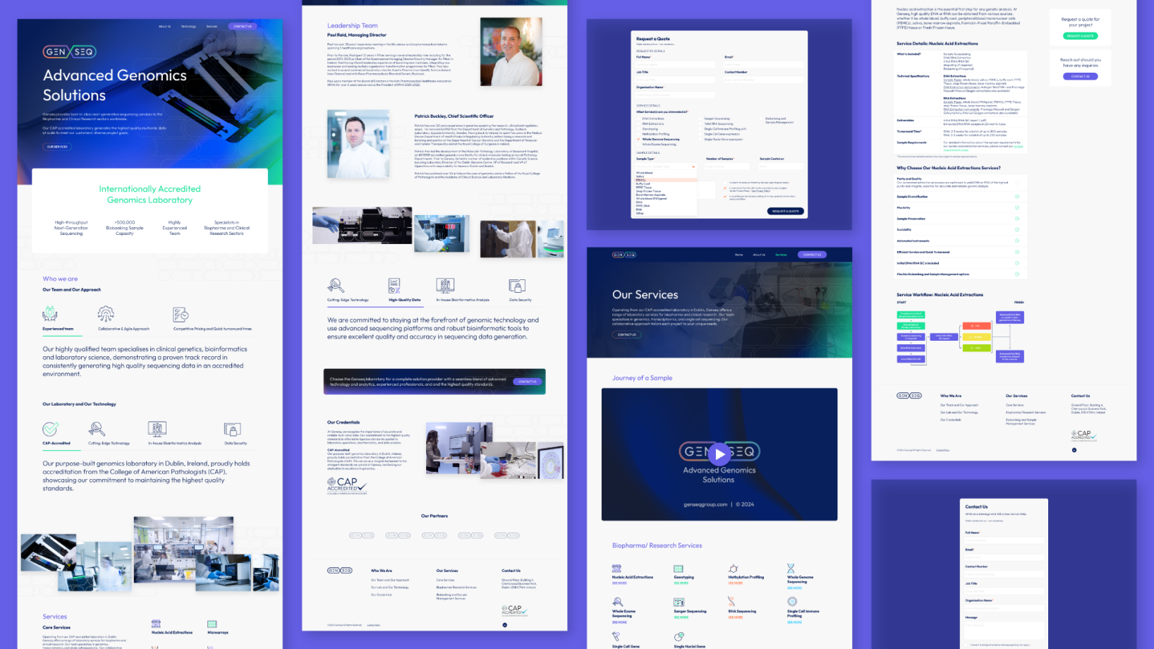
Healthcare websites work as clinical assistants, not brochures. For HCP portals, design should prioritise speed to insight. That means clean information architecture, precise search, clinical taxonomy, and pathways that surface dosing, safety, and trial data without friction. Visual hierarchy, clear tables, expandable safety information, and evidence summaries reduce the time from visit to action.
Patient portals serve different needs. They must be empathetic, readable, and accessible. Use plain language, explain how information was generated, and provide clear next steps. Contrast ratios, adjustable text, dyslexia friendly fonts, and keyboard navigation help more people succeed. Privacy patterns should be visible, not hidden, with transparent data explanations and granular consent. Trust is a design output.
Under the hood, modern build choices matter. Component libraries keep interfaces consistent and testable. Performance practices like image optimization and caching improve Core Web Vitals, which lifts both usability and search visibility. Services should be modular, monitored, and secure by default, with role based access for HCP only content and a rigorous approach to logging and incident response.

Landing Pages & Microsites
Landing pages are decision engines. In healthcare, they often support congress campaigns, new indications, or patient support calls to action. Each page benefits from a single clear goal, with visual focus on the primary action. Use benefit oriented headlines, short supporting copy, and structured evidence blocks that align with the claim hierarchy approved by medical and regulatory teams.
Microsites allow deeper storytelling around a congress theme or disease area. Design should provide multiple on ramps: a quick overview for the time poor, and deeper sections for those who want mechanism of action visuals, case videos, or downloadable materials. Use modular sections that can be reassembled for regional compliance, and keep analytics granular, so teams can see which content helps HCPs and which helps patients.
Form design is critical. Ask for the minimum, show progress, and explain why each field is required. Incorporate consent capture and preferences in friendly language. Whenever possible, provide a way to complete tasks without a sign in. If authentication is required, support passwordless and two factor options, since many HCPs work across multiple devices and networks.
User Journey
User journey design maps reality, not theory. In healthcare, a user journey often crosses sites, devices, and people. For HCPs, the journey may begin with a guideline update, continue through a congress session, and end in a prescribing decision. For patients, the journey may span symptom search, diagnosis, therapy selection, onboarding, adherence support, and community resources.
Start with research. Use qualitative interviews with HCPs and patients, anonymized analytics, and service blueprints that capture backstage processes like MLR review and data orchestration. Identify friction, moments of doubt, and points where reassurance matters. Design interventions should be measurable: fewer clicks to dosing details, higher completion of support enrollment, improved understanding on risk information.
Journey maps guide content strategy as much as interface design. Create reusable building blocks, from dosage calculators to conversation guides, and place them where they support the next best action. Include contingencies for offline moments such as clinic Wi Fi issues or patients on low bandwidth connections. Resilience is part of UX.
User Interface For Medical Apps
Medical apps demand clarity and safety. Follow platform guidelines for familiar patterns, then layer on domain specific standards like clear labeling of units and ranges. Use plain language. Avoid ambiguous iconography. Provide consistent error messages and proactive safeguards, such as confirming unusual values or showing patient friendly explanations of measurements.
Clinical integrity matters. If the app processes measurements, show sources and calculation logic where appropriate. Maintain audit trails for changes to clinical data. Apply progressive disclosure, so advanced features are available without overwhelming first time users. If you display risk information, make it specific and actionable, with links to official guidance.
Validation and testing are non negotiable. Conduct formative testing with representative users, including those with accessibility needs. Include negative testing, such as intentionally poor network conditions or bad input. For higher risk software, align with human factors and software lifecycle standards, and keep documentation ready for review.

Sitemap, Personas
A sitemap is more than a tree of pages. In healthcare, it is a map of decisions. Group content around user goals, such as diagnose, treat, and support, and keep navigational labels precise. Avoid marketing jargon. Use cross links to connect related material, like placing safety information alongside efficacy content, and provide a visible library of downloadable resources for clinics.
Personas must be evidence based. Replace stereotypes with segments defined by tasks, context, and constraints. For HCPs, that could include hospital specialists who need rapid access to dosing and safety tables, or community prescribers who want simplified patient education materials. For patients, personas should reflect health literacy, caregiving roles, and digital comfort. Each persona should include success metrics that map to analytics events, not just demographics.
Keep both the sitemap and personas living documents. As labeling changes or new therapies arrive, your IA and targeting must evolve. Establish governance, version history, and regular reviews with medical and legal teams to keep the information architecture compliant and useful.
Mobile Design
Mobile is the frontline of healthcare UX. Many HCPs check updates between consultations, and many patients rely on phones for education and support. Design for one handed use, large touch targets, and fast paths to the most common tasks. Keep forms short, support autofill, and respect the user’s state by saving progress if a call interrupts a session.
Accessibility is central. Provide adjustable text, strong contrast, and captions on all video. Use native components for predictable behavior. Offline or low connectivity support can be decisive, for example caching patient instructions or storing draft forms for later submission. Add clear privacy affordances on mobile, such as biometrics to protect sensitive data, and easy ways to manage permissions for camera and notifications.
Performance is part of care quality. Optimize for fast load, minimal blocking scripts, and responsive interactions. Monitor real user performance and crash metrics, and feed them into a triage process. Mobile QA should include device labs, assistive technology checks, and security scans. Every release should ship with a changelog and a rollback plan.
Apps Design & Development
Great apps come from cross functional collaboration. Bring product, design, engineering, medical, and regulatory partners together early. Align on definitions of success that balance usability, clinical accuracy, and business goals. Work in iterative cycles with regular user testing, and keep a clear decision record for what goes in now and what waits for a later release.
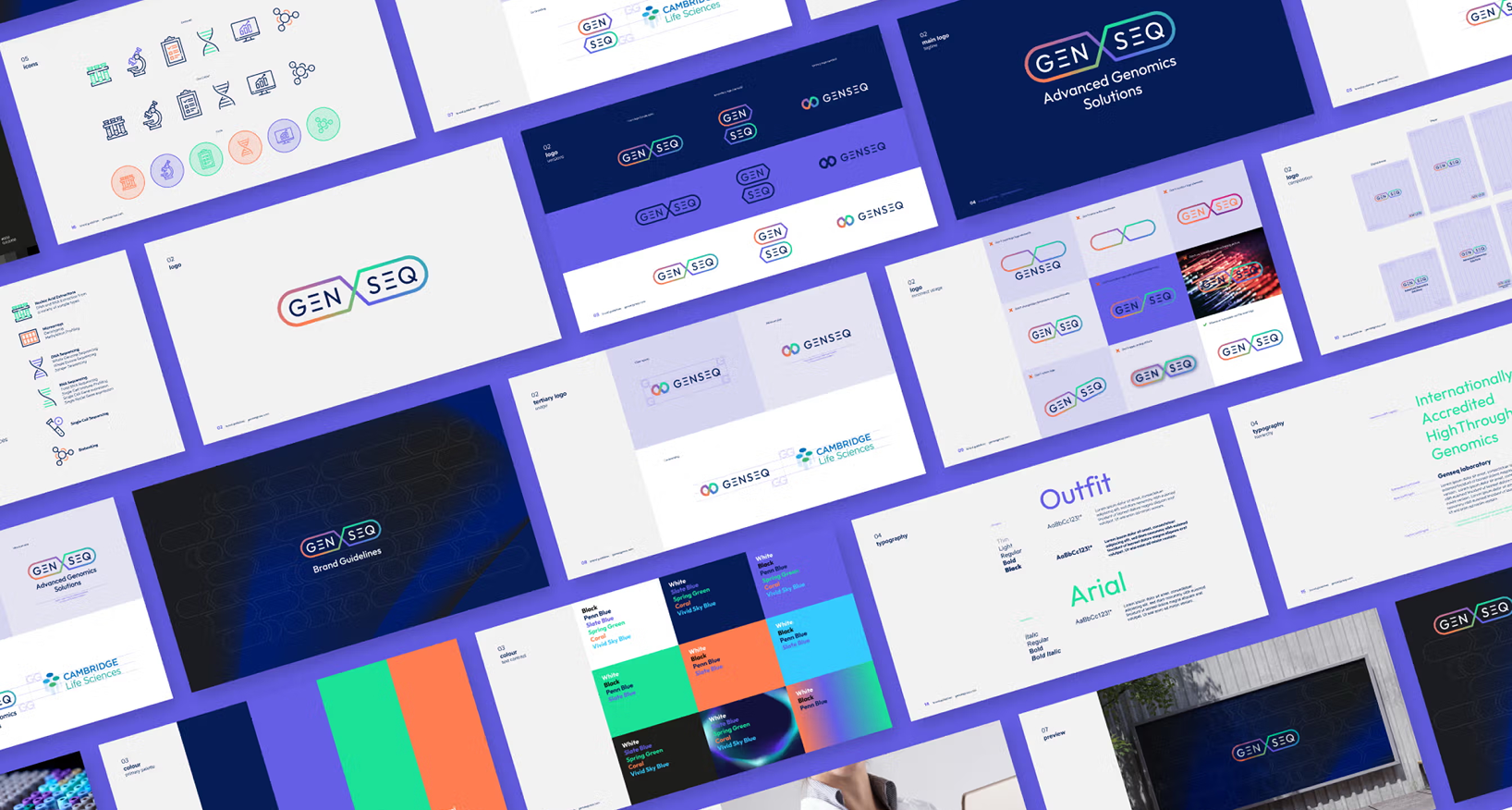
Design systems are accelerators. Define tokens for color, spacing, and typography, and implement accessible components with documented usage. Build patterns for data tables, calculators, consent dialogs, and educational modules that can be reused across brands and markets. Consistency reduces errors, speeds delivery, and lowers maintenance costs.
From a development perspective, security and data privacy are core. Use encryption in transit and at rest, segregate environments, and apply least privilege. Log access, anonymize analytics, and make opt out options easy to find. Invest in automated tests across unit, integration, and accessibility layers. Telemetry should tell you where users struggle, so the team can respond with clarity, not guesswork.
Virtual Advisory Boards
Virtual advisory boards let teams gather insight from HCPs and patient advocates without travel. Good UX makes participation easy and respectful of time. Provide clear agendas, time boxed tasks, and intuitive tools for voting and annotation. Use secure authentication and role based permissions, and make it obvious what is on the record and what is off the record.
Design for engagement. Break sessions into short modules, with guided prompts and single task screens. Offer device flexibility, including mobile participation. Provide accessibility support, such as live captions and keyboard navigation. After the session, give participants a personal dashboard that shows key takeaways, next steps, and a safe space to review materials or add comments.
Compliance and privacy sustain trust. Record consent, store materials responsibly, and keep audit trails for changes to meeting artefacts. Provide internationalization and time zone awareness, since many boards are global. Above all, close the loop by showing contributors how their feedback shaped decisions. Respect is the ultimate user experience.
Bringing It All Together
Good healthcare UI and UX translate complexity into clarity. The craft is not about decoration. It is about rigour, empathy, and continuous learning. Start with user goals, design for accessibility and privacy, and test with real people in real settings. Use data to refine, and keep governance strong so the experience remains compliant as it evolves. When design is done well, clinicians move faster, patients feel supported, and the system works a little better for everyone.
Contact us today to discuss how we can collaborate to design and create your next brand campaign.We'll be delighted to help!

