The Creative Care Factor:
The Power of Strong Creative in Corporate Rebranding for Healthcare and Pharma
Corporate rebranding in healthcare and pharma is not a cosmetic exercise. It is a high stakes transformation that must win the confidence of clinicians and patients, satisfy regulators, unify global teams, and make complex science understandable. Strong creative is the engine that makes this possible. It turns research into focus, policy into clear rules, and ambition into a system people can use every day. Below is a practical framework, using six core pillars, to guide a high performing rebrand in this tightly regulated landscape.
Brand Development (Research & Analysis)
Every effective rebrand in health starts with evidence. Assumptions age quickly as practice guidelines evolve, competitors pivot, and reimbursement rules change. Robust research keeps the work grounded in reality and protects against fashionable but fragile ideas.
Begin with an ecosystem map of decisions and influencers. Include payers, hospital procurement, pharmacists, KOLs, patient advocates, regulators, and frontline staff. Capture the real frictions that slow adoption, such as documentation burden, safety concerns, or service reliability. Blend qualitative depth from interviews and advisory boards with quantitative validation from surveys and desk research. Audit your current brand while you are at it. Assess recall, distinctiveness, clarity of value, and compliance risks across presentations, websites, packaging, and sales materials.
Translate insights into sharp creative implications. If trust hinges on transparency, build a visual and verbal system that surfaces sources, study sizes, and limits of claims. If speed to decision matters, design for scanning with clear hierarchies, plain language, and predictable layouts. If the company must speak to both clinicians and patients, define audience switches early, including tone, accessibility needs, and the different proof each group expects.
Run risk assessment in parallel. Flag phrases that sit near promotional boundaries, benefits that require qualifiers, and visuals that must meet accessibility standards. Involve medical affairs and legal early to reduce later rework. The output of research is not a pile of charts. It is a focused creative strategy that answers three questions with confidence: who are we for, what problem do we solve for them, and how will our identity and messaging prove it.


Brand Naming
Corporate naming in healthcare is sensitive, visible, and long lasting. The name must be memorable and pronounceable across languages, but also free from confusion with active ingredient names or established generic terms. It should never imply a therapeutic claim for the corporation itself.
Structure the process. Define territories for exploration, such as science and precision, partnership and care, or progress and reliability. Use creative sprints to generate a wide longlist, then apply a naming matrix that scores meaning, tone, cultural fit, linguistic risk, and legal availability. Run multilingual checks to avoid unfortunate homophones or clinical associations. Shortlist with discipline. Stakeholder testing should ask people to choose, not to design, and should measure recall and perceived fit rather than personal taste.
Strong creative brings names to life. Build small narratives around finalists with draft taglines, one paragraph origin stories, and sample applications on stationery, decks, and a simple landing page. A decent word can feel great when it carries a clear idea and looks good in real use. That is how you earn internal adoption and external recognition.
Brand Messaging & Positioning
Positioning in healthcare and pharma must be both inspiring and defensible. It should state what you do, how you do it differently, and why it matters for people and systems. The promise must hold true across therapy areas and regions, and it must translate into messages that work for varied audiences.
Use a layered structure. Start with a concise promise that reflects your purpose and strengths. Support it with three or four value pillars that cover the drivers your audiences care about, such as data integrity, supply reliability, clinical partnership, or service speed. Under each pillar, prepare proof points that can be cited. Examples include quality audit performance, turnaround times, manufacturing uptime, real world evidence programs, or sustainability achievements. Keep the headline human and the proof accessible.
Tone is a strategic choice. For clinicians and regulators, use balanced and transparent language. Avoid superiority claims or implied clinical benefits unless they are properly qualified and context is made explicit. For patient facing material, use plain language, empathetic phrasing, and strong signposting to support services. Provide microcopy patterns that teams can reuse, such as how to introduce risk information, how to reference studies, and how to describe partnerships without implying endorsement.
Strong creative turns this architecture into tools. Build a message house for leadership, quick elevator copy for field teams, and a library of short, citeable proof points. When the messaging is clear and consistent, you reduce approval friction and speed up local adaptation.

Corporate Branding
Corporate branding sets expectations long before a product conversation begins. In health, the strongest corporate brands feel dependable, open, and collaborative. The job of the creative system is to make that feeling repeatable in every context, from investor reports to clinical education.
Start with brand architecture. Decide how the corporate brand relates to product and program brands. A house of brands can isolate promotion risk in sensitive categories. A branded house can concentrate reputation and simplify conversations with procurement and partners. Document the logic clearly so teams know when to lead with the company and when to lead with a solution.
Design for operations, not just for show. The system must work on regulated materials, grant submissions, training packs, community outreach, and building signage. Provide production ready templates for presentations, RFP responses, safety notices, and medical review packs. Make accessibility non negotiable. Specify minimum type sizes, contrast ratios, and layout rules that survive translation into multiple languages. Curate photography that reflects real care settings and diverse audiences, and avoid stereotypes or staged scenes that undermine trust.
Plan change management with the same care you give design. Line up executive sponsorship, create learning sessions for field and medical teams, and define a phased rollout for packaging, systems, and facilities. Provide a help channel where people can get quick guidance on correct usage and get approvals faster. Adoption is where creative either earns its value or fails.
Brand Guidelines Creation
Guidelines translate intent into daily practice. In healthcare they also reduce compliance risk by making boundaries explicit. Write them for humans, not only for designers.
Begin with the brand idea and a small set of communication principles that flow from your research. Then move to practical rules with generous examples. Cover logos, colour, type, spacing, and imagery. Add voice and tone guidance with samples for clinicians, patients, investors, and partners. Provide a standard approach to evidence citation, qualifiers, and balance statements. Define data presentation rules, including label clarity, readable scales, and notes on study limits. Build modular templates for fact sheets, social cards, conference posters, and advisory board materials, each with space for legal statements.
Strong guidelines encourage creativity by removing uncertainty. Local teams can build high quality assets quickly because the guardrails are clear. Host the system in a digital asset manager with search, version control, and permissioning. Pair it with short training videos, a simple brand quiz for certification, and periodic audits. Capture good local examples and add them to the library so the system improves over time.


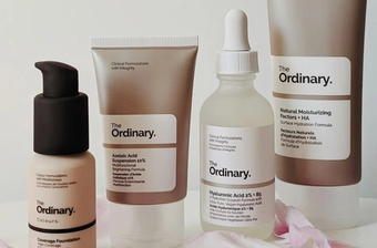
Logo & Visual Identity Design
Logo and visual identity are the most visible outputs of a rebrand, but they work best when they serve clarity rather than novelty. In healthcare and pharma, your visual system must signal trust, capability, and care while staying flexible enough for technical and human stories.
Approach the logo with restraint. Prioritise forms that are distinctive yet simple. Avoid literal medical imagery unless treated with sensitivity. Build a lockup system that can flex across languages, legal entities, and co branding. Test the mark at the sizes that matter most, such as app icons, lab labels, and presentation footers. Prepare colour and monochrome versions for different substrates and printing methods. Pair the mark with typography that supports long reading and data heavy layouts without fatigue.
Extend the identity with a purposeful visual language. Use a restricted palette with accessible contrast combinations. Define chart styles that make complex information easy to grasp at a glance, and provide examples of good and poor practice. Create illustration or iconography that explains processes, safety protocols, and service pathways. Establish photography rules that prioritise authenticity and consent. Set motion principles for video explainers, platform UI, and event screens, including pacing, transitions, and lower third styles.
Prototype in real workflows before you finalise. Apply the system to a clinical education slide, a tender response, a safety data sheet, a web landing page, and a patient information leaflet. Check for readability, print performance, and compliance. Iterate based on feedback from medical affairs and frontline users. Document the outcomes and fold them into the guidelines so teams benefit from the learning.
Bringing It All Together
A successful corporate rebrand in healthcare and pharma balances imagination with discipline. Research and analysis keep the work honest. A considered name sets a clear direction. Messaging and positioning build a voice that is distinctive yet responsible. Corporate branding turns values into systems people can use. Guidelines make quality repeatable at scale. Visual identity delivers recognition without compromising clarity.
The returns are practical. You reduce rework, shorten approval cycles, and help local teams move faster. You increase confidence among clinicians and procurement teams by making information easier to evaluate. You improve patient understanding with accessible design and plain language. Most of all, you create a coherent experience that makes it clear what you do and why it matters. In health, that clarity is more than a competitive edge. It is a public good.
Strong creative is not decoration. It is the way a healthcare company proves its intent, organises its complexity, and earns trust over time. With a research driven strategy, disciplined execution, and tools that respect the realities of regulated communication, your next chapter can launch with confidence and build momentum with every interaction.
Contact us today to discuss how we can collaborate to design and create your next brand campaign.We'll be delighted to help!